|
|
|
Grouped visualization
|
Direct scaled visualization
|
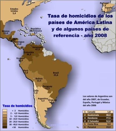
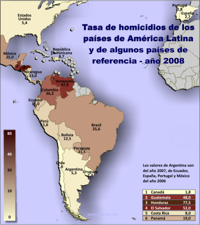
Both maps are demonstrating the same content, but there is the difference in the value treatment - grouped or directly scaled. Advantage of the grouping procedure is the possibility to recognize similar values easier, meanwhile the direct evaluation shows also the difference between the values in the same group - in the example, the homicide rate of Argentina is the double as the same indicator in Uruguay - grouped they are in the same range, directly evaluated the recognize the difference.
For huge numbers of areas to evaluate appears to be better grouping the values of the mapping indicator, for smaller numbers of areas is the direct scaled evaluation more expressive. We can offer you both possibilities, according to your specifications.
These bi-dimensional diagrams – colouring the corresponding area in the corresponding colour is the most used for geo-referencing data. All prices we are displaying in the data set of the countries we have included until the moment are based on this type of diagram map.
)
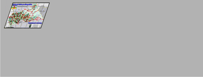
Complex graphical map example
Additionally there are other types of diagrams, like the one we have displayed here. Here are the time series of criminal activities in the provinces of South Africa placed on the corresponding geographical area. This type of diagrams is very “eye catching” and a good possibility to link numbers with geographic area. These type of graphics is more time consuming in the production and therefore more expansive in the price. The here shown was developed for a slideshow, using so lower resolutions and easier. This type of preparation is possible to use in slideshows, technical reports, etc. For a printing house the resolution must be higher and is therefore again more expansive.
Consult us for the price of the problem you like to map, and see the solution with your logotype!
In dependence of the complexity and the preparation work the price can oscillate between 100 and 350 € per diagram. There discounts in function of the number of maps possible.
Fast selection
This could be
intersting for you
Development of Terrorism
in Middle East
External links change quickly - If you get a link error - Please inform us!
